Tutorial by Liz Vikla of CS Blue Bamboo
Click HERE for a link to her blog!
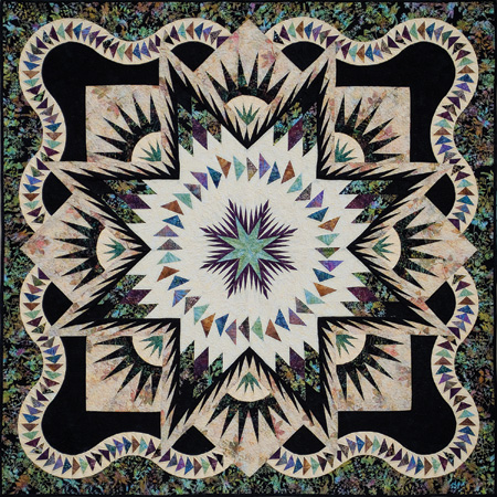
How to Choose Fabrics for the “Glacier Star” by Judy Niemeyer
Step 1: Choosing your outer border “inspiration” fabric
Often in quilts the outer border is the place where we can chow off a fabric that “ties the entire quilt together.” The Glacier Star is no different. Starting off I suggest that you spend 10-15 minutes of pure play time pulling whatever bolts catch your eye.
What I think makes a good outer border fabric:
- Contains 3-5 colors
- Is not a solid or a plain texture
- Is not too large scale of a print
- Has some kind of movement going on it
- Is not a stripe
- Has a medium sized design
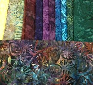
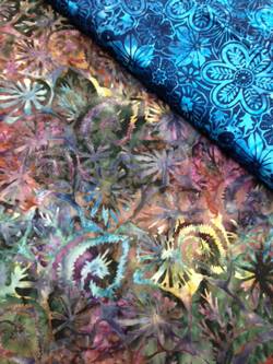
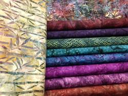
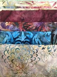
For my example in this tutorial I chose this irresistible fabric from Robert Kaufman:

It is a beautiful fabric with several color groups represented by various shades: purple, teal, blue, teal green, pink, burgundy, brown and gold.
Step 2: Make a giant mess (No, really!)
Now that we have our outer border fabric chosen, we have a palette from which to work off of for finding companion fabrics. The battle is about halfway done at this point.
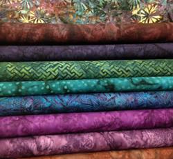
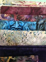
I suggest grabbing about 15-20 bolts in a wide range of colors and textures that loosely correspond to you border fabric. This is not yet the time for nitpicky perfection, so grab anything that looks even close to the right idea.
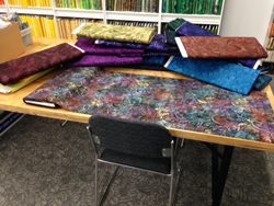
Step 3: Audition your ideas
I like to organize my fabrics by like colors/values together and then lay out my inspiration fabric on top of them. This really helps to show which fabrics stick out in a bad way.
(Small tip: take a picture on your phone to figure out what isn’t working. Condensing your viewpoint can make subtle things more obvious.)
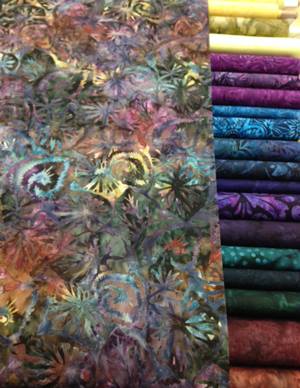
With my first glance, I spot 4-5 fabrics that don’t work because they are too bright for our inspiration fabric. (I love having some pop here and there in a quilt, but too much of a good thing is sometimes overpowering.)
Which bolts would you get rid of?
Step 4: Audition individually/small groups
Isolate the outer border fabric with each fabric on its own, or within a small pairing.
The picture shows a fabric that I actually tossed just based on the first pass, however, it is an excellent example of this second phase of auditioning.
Reasons why this fabric does not work:
- It is too bright compared to the relative muted hues of the border fabric
- The pattern design is distracting and busy
- The designs fight with each other for attention
It seems that the trick with this fabric is finding the right balance between muted hues and bright.
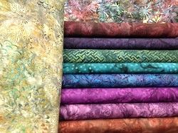
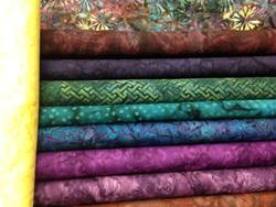
This is our second round group of choices. This is solely based on how these fabrics work with the border fabric. I am not 100% happy with these fabrics yet, but that is OK. We’re still in the playing phase!
Auditioning Backgrounds:
Now we need to start finding some backgrounds. For this project we need three backgrounds. One is for the flying geese backgrounds in the border (and is also the background for the tiny fritzy-do in the New York Beauty block). Another is the background for the large spikes in the New York Beauty block, and the feathered star blocks. The last background is for the center.
My philosophy when looking for background fabrics is that I like the flying geese background to have a bit of a pop or zing to it. It’s an easy place to get away with something different because it’s not overwhelming to the entire quilt. The other two backgrounds I like to be softer, and perhaps go with each other since they are the majority of the quilt.
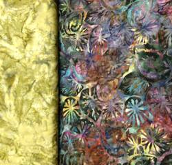
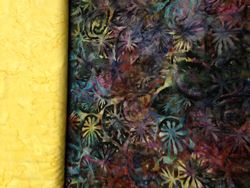
The picture above shows one idea I have for the backgrounds. It’s a nice olive green fabric. But before I get carried away I need to see it auditioned against the future flying geese blocks.
Why it doesn’t work:
- While not being a medium value toned fabric per se, it is still a tick too dark to provide enough contrast with the geese.
- The olive tones work nicely with the original fabric, but they begin to fight with the blues and greens here without anything else going on.
Oooooh!!! I think we just hit the jackpot! The color is a bit lighter in the background, and there is a bonus of having some of our flying geese colors showing up in the bamboo pattern. (We can all thank Boo for finding this shocking choice.)
It was easy to find a second background choice that was in a very similar coloring but featuring small mums on it instead.
This is my choice for the flying geese background. It’s a tiny bit brighter with a lovely pop to it and I think it will be perfect nestled in between the two border fabrics. This is a great place to have a bit of brightness without taking over the entire quilt. However, we need to make sure it will play nice with the other fabric children!
Step 5: Testing Fabrics Outside Inward (Borders to Feathered Star)
Even though a quilt design may be flat, you still have to consider multiple angles when choosing the right fabrics. Sometimes you can pull the perfect shade of a color, but it’s too dark and doesn’t provide any contrast within the design. Because of this I start putting my fabrics in the order they will appear within the finished product.
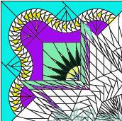
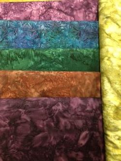
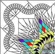
To help you follow along, here is an image of a quarter of the Glacier Star. For this next part I will be talking about the outer border(aqua), flying geese/small fritzy-do background area(yellow/white), the inner border/feathered star spikes(fuchsia), New York Beauty background(mint green), New York Beauty Spikes(dark green), small fritsy-do spikes(dark blue), feathered star background(mint green), and feathered star spikes(purple).
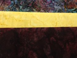
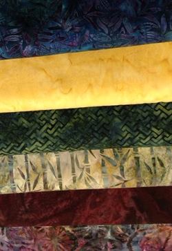
The top fabric represents the outer border. The middle fabric is the background of the flying geese. The lowest fabric is the inner border/feathered star spikes.
I like having a dark fabric, if possible, for the inner border/feathered star fabric as it adds a bold element of contrast to the design. This pattern requires enough skill and technique that you want to smush this fact in the face of everyone who sees your stunning final product. Make them see how amazing you are by showing off the elements!
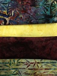
Now I have added our choice for the New York Beauty block background since that is the next fabric line! We can ascertain how well it will work with our inner border fabric as it touches it both in the New York Beauty block and in the feathered star units! Our choice looks to be excellent!
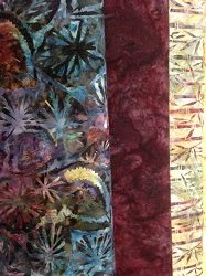
This next addition shows off the spike fabric which is a lovely dark green batik.
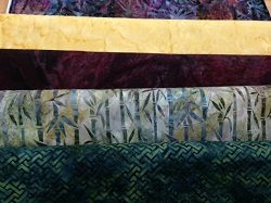
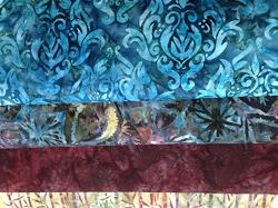
Now we add in the background fabric that was used in the flying geese background, and a dark blue for the tiny spikes in the fritzy-do block. It’s important to take a moment to remember that these auditions are a crude preview of how the fabrics will interplay with each other in the final project. The dark blue in this image may seem to overwhelm the other fabric choices, but it will end up being a very tiny dark accent. It also does not appear to go well with other fabrics in this grouping based on this photo. However, it was a beautiful choice next to out original fabric.

The feathered star blocks come next and they are composed of the inner border fabric plus the background for the large spikes in the New York Beauty.
Step 6: Testing Fabrics Inward Towards Center (Lone Star to Snowflake)
Our Lone star is compromised of diamonds with the top(purple), center(aqua), and zinger(red). The next block has geese floating in the pond with background(yellow) and geese (black). The center snowflake itself is in white.
Here you can see our feathered star fabrics with the background fabric, spike, and the beginning of the Lone Star. The top of the Lone Star is a single diamond that matches the dark spikes in the feathered star. The center of this unit is the same fabric we used in our outer border.
This shows our choice for the zinger diamond piece in our Lone Star. We thought it would be nice to have a little pop of teal blue there.
Here we add in our background choice for the center as it is the next fabric in order. I’m starting ti get really excited about it, are you!?!
And here we have the full run from feathered star at the top, down the Lone star, into the center background, and finally the two fabrics that make up the snowflake at the center.
Some tips on choosing center snowflake fabrics:
- I think it is a great opportunity to mimic the shape/contrast of the large feathered star spikes with the snowflake spikes. Sometimes I use the same fabric for the snowflake spikes as I did for the feathers.
- I think it is best to have a dark spike fabric and a medium/medium-dark fabric for the center. It is more dramatic and helps bring some contrast to the center to balance out the borders.
Step 7: Admire your future masterpiece!